In this competitive world, we are bombarded with huge amount of data on a daily basis. Whether we are scrolling through social media or watching TV, data is being consumed everywhere in the form of content.
Top-notch marketers believe that content can make or break your brand. Gone are the days when companies used to present their data in the form of written documents. Life is busy and no one has time to go through the long and boring content. Thus, the concept of data visualization emerged as a breakthrough for boring text and become one of the best strategies in contemporary marketing practices.

The term “data visualization” refers to the graphical representation of data and information. It enables the reader to get huge information in the blink of an eye. Graphs, charts, and maps are used in data visualization. It helps the audience to easily understand the patterns and trends in business.
Business is not just about numbers and figures. As per psychology, human nature loves colors and patterns, thus data visualization is considered as an imperative tool in content marketing. In this article, we will discuss some tips and tricks that will help you in supercharging your content strategy. So, read on:
Set a Story
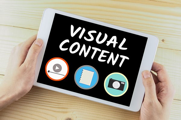
Once you have decided to add visual content in your content marketing strategy, the next step is to decide the story that your visual content will display. Here you have to think like a journalist. Think deeply and see the ins and outs of the story. Look for visual content created by top brands of the world and how they gave their message in it.
Gather Tools for Data Visualization
Your next step is to select the tools that will help you in visualizing the data. People having a little design sense usually do well in this step while others take graphic design services from professionals. A number of tools are available among which some are free and some are to be paid for. Some of the commonly used tools are:
- Google Sheets
This tool is free and one can easily make timelines, graphs, and charts on it.
- Google Charts
It is used for creating data graphics for the website.
- Powered Template
By using this one, one can easily download pre-made charts, templates, and diagrams.
- Canva
It is also used for creating interactive infographics and charts.
Know Your Target Market
Before promoting your visual content, you should know your target market. For instance, Facebook and Twitter and good for sharing charts and graphics but Pinterest is best for sharing how-to articles.
Promote Visualizations Excellently
Spending a lot of time in creating compelling visuals will be of no use if you do not promote it properly. For this, you need to directly communicate with the audience by using social media sites. Direct e-mailing is another great approach for promoting your visual content. Your ultimate aim should be making your visual content viral among your target market.
Research and Testing
Do not forget that research can do wonders for you. There a number of tools for researching and testing your data. You should analyze smartly that what is working for your strategy and what is not. You can use different tools to conduct your research.
Accuracy of Data
People love to watch visuals, especially when they are displaying accurate data. Remember that the image of your brand is at stake. Thus you need to make sure that your data is accurate. If the audience gets inaccurate data, your brand will lose a huge number of potential customers. It is due to the reason that your audience does come to see your visual content but unfortunately, it was not happy with the information.
There is no harm in gathering information from a third party. In this case, make sure that the data is trustworthy.
Try to Gather Unique Data
Data visualization is also used in creating unique brand identities. It is a great way of marketing since smart marketers are using unique data to show how they differ from their competitors. Gathering unique data provides a twofold experience of attracting readers and gaining a competitive edge against rivals.
For this, you need to make much more effort in the research process. Data collection sounds simple but it is the most time-taking part. Collecting huge data is not difficult but selecting the useful one and turning it into visual data is the real game.
Real-Time Data can Make You Stand Out
Presenting real-time data is another great way that can attract a huge group of potential customers. Many big brands showcased their real-time visual data during the Black Friday sale. The purchases made in a 24 hour period were recorded and then displayed on social media sites. If this would have been done in long and boring paragraphs, people would not have read it.
Real-time data develop a trustful relationship between the brand and the customers. When they see that you are displaying something that is just happening, the level of trust automatically increases. This is not the case with other forms of data since some readers have doubts about its accuracy.
Final Thoughts
Summing up, data visualization is the dire need of competitive content strategies. Without data visualization, surviving in the competitive market is hardly possible for any brand. In order to grab the reader’s attention, you have to do something extra-ordinary and data visualization can fulfill this. Making short and creative visuals of your data will definitely give a marked difference in the number of visitors. However, it is imperative to plan everything beforehand and work accordingly.
Data visualization is not a one-day process. It will definitely increase the cost and time of the content marketing process. Designing charts, graphs, infographics, and using data visualization tools calls for a good budget but in spite of all this, data visualization is a worth-doing thing. It dramatically boosts your content marketing results and helps in building a unique brand identity.